The new film Spider-Man: Across the Spider-Verse emerges in a rather different cinematic landscape than the one its predecessor, Spider-Man: Into the Spider-Verse, did five years ago. For the uninitiated, the animated Spider-Man series imagines that its central web-slinging hero, Miles Morales, exists within a vibrant “multiverse” of worlds where different incarnations of Spider-Man rule the roost. While the multiverse was novel back in 2018, it’s a concept that has subsequently become a little played out within comic book films, in particular the movies of the Marvel Cinematic Universe. But they learned the wrong lesson from Spider-Man: Into the Spider-Verse – seeking out the multiverse’s opportunities for a free-for-all of franchise possibilities, with different characters and different incarnations of characters able to be paired together at will, while passing over Into the Spider-Verse’s real draw, which was its embrace of the visual idiosyncrasies of superhero comic books and using those in service of a fresh visual language. In Spider-Verse, a “multiverse” means, above all, a chance to break some rules rather than conform to formula.
More like this:
– 11 of the best films to watch in June
– Is the superhero film dead?
– Why Sam Raimi’s Spider-Man was one of a kind
The first film stood out for the way in which directors Peter Ramsay, Rodney Rothman and Bob Persichetti got their team to paint Miles’ world, a fresh style borne from an incorporation of traditional animation techniques and comic book art into new technologies. Its often nostalgic evocation of these elements made Miles Morales, a relatively new character in the Marvel comic books, feel like he has always been around, every part as iconic as Peter Parker.

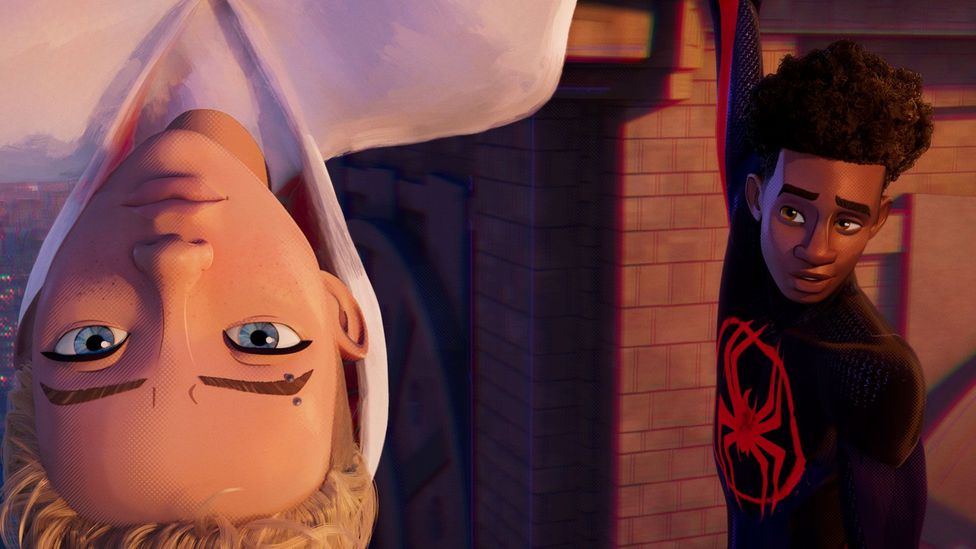
The new Spider-Verse is even more visually stunning than the first film, paying homage to a dazzling range of comic book artist styles (Credit: Sony Pictures)
Where other superhero movies might take a story, and maybe a famous composition or two, from the graphic source material, the teams of filmmakers and artists on both Spider-Verse films work in concert to bring the dynamism of comic books to life. The first Spider-Verse film drew acclaim for its combination of the language of animation and film with that of comic books. One such example can be seen in the use of onscreen written sound effects, like the classic Spider-Man sound “thwip!”. Or its “burst cards” – 2D drawings that flash up amid the action for emphasis. Such moments feel briefly suspended in time, like you’re observing a panel of art come to life and blown up on the big screen.
It’s rare to see comic book movies actually use the textures and tactile qualities of print; many noted its use of halftone, Ben-Day dots and “Kirby Krackle” (clusters of dots first used by revered comic book artist Jack Kirby to imply cosmic energy). In a number of interviews, Justin K Thompson – Into the Spider-Verse production designer, now Across the Spider-Verse co-director – highlighted the animation’s embrace of the imperfections of print. Take the way in which the film’s chromatic aberration recalls the accidental colour separation and mismatches that would emerge from the four-colour printing process.
Through its gargantuan team of artists and animators (numbering more than 1000), Across the Spider-Verse doubles down on the first film’s exhilarating sensory overload, experimenting visually as well as narratively with what a Spider-Man story could be on screen. Every formal element of the previous film is even more prominent, as with the way some characters are animated “on twos” – at 12 frames per second of screen time – rather than “on ones” – at 24 frames per second, which is the standard for 3D animation. The resulting minuscule delay between frames creates an effect that feels like the movements of a flipping page.
But with the introduction of the character of Spider-Punk/Hobie Brown in the new film, voiced by Daniel Kaluuya, the animators do something even more dazzling. Here, different elements of the same character, who already looks like a zine cutout, all move at different speeds. Instead of just moving on ones or on twos, his body also moves “on threes” and his guitar “on fours” – true to his anarchic character, instead of evoking flipping pages, he’s like a bunch of pages being thrown at you.
Across the Spider-Verse also expands its palette to reflect the vastness of comic book artistry, using its kaleidoscopic journey into different universes in the multiverse to go further beyond the textures of the first, adding new and specific homages to different artists’ methods. The first we see is Gwen Stacy/Spider-Woman’s universe, recalling the expressive brushwork of Robbi Rodriguez’s cover art on the 2015 Spider-Gwen comic to breathtaking effect.
It’s one way in which Powers, Dos Santos and Thompson pushed to incorporate the identity of even more artists into the film. To take other examples, the directors cited Spider-Man 2099 co-creator Rick Leonard’s inking techniques during visual development for the Spider-Man 2099 screen incarnation (voiced by Oscar Isaac), and the film’s take on Ben Reilly, aka Scarlet Spider, channels artist Tom Lyle’s original character designs while lovingly poking fun at the brooding of 1990s comics. If the first Spider-Verse was about channelling a love of the medium’s traditional textures into its craft, Across the Spider-Verse looks across decades at how it has evolved. And through its narrative, it thinks about the need to continue changing, questioning ruthless conformity to superhero canon and years of tropes.
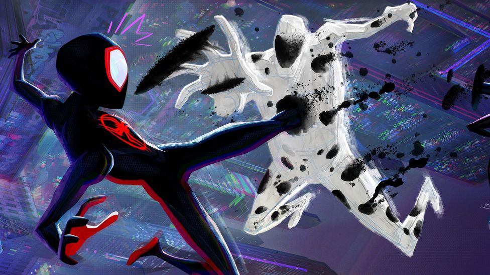
Meanwhile Across the Spider-Verse’s main villain The Spot is a perfect expression of the films’ embrace of the imperfections of the artist’s hand. Both him and Spider-Man 2099 maintain their underlying geometric sketch lines, hanging off them like an unfinished drawing, but Spot has the added insult that, with his white appearance covered in dark splotches, he looks like a page that someone spilled ink on. That sense of misshapenness is built into the character, who is driven by outrage at becoming a cruel cosmic joke, an accidental byproduct of someone else’s adventure. As he and Miles bounce between the radically varied universes of the sequel film, it becomes clear that Across the Spider-Verse’s visual non-conformity is thematic, an expression of Miles’s resistance to fitting within a narrative box that his schoolteachers and fellow Spider-People try to place around him.

Across the Spider-Verse villain The Spot is one of the many memorable-looking new characters, made to look like a page that someone has spilled ink on (Credit: Sony Pictures)
So often, contemporary superhero movies are content to lift storylines from comic books, with little of their spirit – but the Spider-Verse films really do honour the latter. This is of course not the only way to adapt comic books well. But as of right now, they feel like films that are both truest to the spirit of the medium of comics, and testament to the expressive potential of animation. That’s because Spider-Verse’s visuals aren’t just a complement to the story – they are part of the story. Indeed, they seem to have lit a fire under the right people in Hollywood, heralding a boom in varied, stylised approaches to animation in recent big releases like The Mitchells Versus the Machines, Puss in Boots: The Last Wish and the upcoming Teenage Mutant Ninja Turtles: Mutant Mayhem (a few of which have some crew overlap with the Spider-Verse films).
The two movies – which will be joined by a third and final Spider-Verse film, set to be released next March – are also a reminder that writers are but half of what makes a comic book. Remember the colourists, the pencillers and inkers, the letterers and cover artists – they have as much authority over the depiction of these characters as the writers do. While so many films solely treat comic books as containers for intellectual property, the Spider-Verse films have once again broken from formula, embracing the true potential of what a comic book movie could be.