The stratospherically rich famously love to wear under-the-radar European fashion labels that only their peers will clock – a tacit affirmation of their superior social status. Now this stealth-wealth aesthetic is being echoed by a style of interior décor that is equally beloved by the super-affluent. It is explored in a new book Quiet Luxury, featuring 18 homes in Paris, Madrid, Dubai, New York, Melbourne, Stockholm, Athens, and Knokke and Hooogstraten in Belgium.
More like this:
– Why ‘living retro’ is perfect for now
– Can luxury ever be sustainable?
– Inside Japan’s most minimalist homes
In his foreword to the book, Wim Pauwels writes: “Quiet Luxury refers to understated architecture and interiors made with very high-quality materials. All interiors are a non-ostentatious take on luxury, with a focus on exquisite materials and fabrics, muted colours, timeless designs, pared-back chic. It is all about developing a personal style that the architects, interior designers and homeowners believe in, far away from volatile trends.”
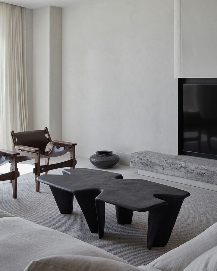
The book Quiet Luxury explores interiors worldwide that share a luxe but understated aesthetic such as this design by VSHD (Credit: Oculus)
Pauwels tells BBC Culture: “People increasingly value quality, craftsmanship and longevity over disposable items. This is a reflection of a deeper cultural shift towards sustainability, minimalism and a focus on well-made, enduring pieces. Quiet luxury emphasises simplicity, and a connection to natural materials.”
Don’t be fooled by the look’s apparent cultural neutrality and homogeneity, however: in the main, the style slaloms between referencing American and European modernism. Author and cultural commentator Peter York traces the pedigree of this aesthetic in both fashion and interiors to well-heeled East Coast Americans, epitomised by the moneyed milieu portrayed in the hit TV series Succession – although its protagonist Logan Roy is self-made, the series is inspired by such established media dynasties as the Hearsts, Mercers and Sulzbergers.
“It’s a small, important, fading minority of mostly Northeastern preppy types of old money in American terms,” says York. “Fred Astaire and his sister Adele, who married a British toff, spent a lot of time in London in the 1930s. The Kennedys were tribal with the Devonshires. American plutocrats love British clothes, especially men’s clothing. And they love our interiors. Clive Aslet’s book, An Exuberant Catalogue of Dreams: The Americans who Revived the Country House in Britain, is about American owners of English country houses who restore English country houses, making them perfect, if sanitised. To be fair, they often do this very well.”
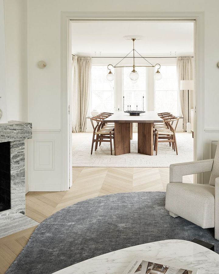
AOJN’s pared-back home aesthetic creates a tranquil, calm mood (Credit: Kristofer Johnsson)
He sees the English country-house look as an early variant of quiet luxury. Its 20th-Century incarnation was a transatlantic confection, popularised by US heiress and interior decorator Nancy Lancaster, who collaborated with John Fowler, co-founder of quintessentially British decorating firm Colefax & Fowler. She helped cement Anglo-American ties by buying the business in 1948.
York believes quiet luxury has less influence now in the US because Americans are becoming less Anglophile. “It’s a shrinking sector but won’t disappear,” says York, who is not a fan of the look. “This style, founded on people’s idea of European subtlety, is now international anyway – and it’s fantastically boring and bland.”
Architect Richard Parr, whose practice, Richard Parr Associates, designs many rural homes in Britain, sees Italian fashion and interiors as a major influence: “This understated style is very much that of Giorgio Armani. Among the uber-affluent, it’s much classier not to broadcast logos. As you’d expect, the Armani Hotel in Milan, which opened in 2011, and is housed in a 1930s palazzo, is the original take on quiet luxury greige. It’s stood the test of time, never been refurbished.”
Clean lines
Simplicity fused with opulent elements were espoused by modernist and mid-century architects and designers. An iconic example is Ludwig Mies van der Rohe’s Barcelona Pavilion of 1929. While uncluttered and free of ornamentation, it feels luxurious thanks to its use of rich materials, including dark green Tinian marble and rust onyx, some used for structural elements such as walls. A taste for measured luxury is also evident in its furniture, notably van der Rohe’s Barcelona chair with its caramel leather-upholstered seat and chromed steel frame.
“Quiet luxury can be seen as a contemporary interpretation of the ‘less is more’ principle coined by Mies van der Rohe,” says Pierre Petit, co-founder of Paris interior design firm Atelier DAAA. The book Quiet Luxury features its renovation of a Haussmannian apartment in Paris. “Its primary characteristics lie in a use of simple elements, clean lines and understated materials, aiming to be free of non-essential embellishments,” he explains. “If its manifestation in fashion recalls Shiv Roy’s camel cashmere wardrobe, its equivalent in décor could be a chair wrapped in mohair velvet or [modernist designer] Charlotte Perriand’s Berger stools. It’s a philosophy that whispers rather than screams luxury.”
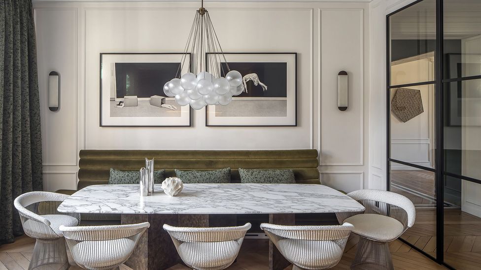
Atelier DAAA’s renovation of a Hausmannian apartment in Paris is clean and understated (Credit: Cafeine)
Atelier DAAA’s apartment highlights another characteristic of quiet luxury – it doesn’t necessarily banish classical, decorative elements. “Its moulded ceilings are accentuated by marble-clad arches,” continues Petit. “In general, choice of materials is crucial – metals are bronzed or softened not polished; woods remain raw and untreated, velvets look muted not glossy.”
Another project in the book called Stairway to Heaven, also in Paris, designed by Véronique Cotrel, takes its cue from US mid-century modernism. “I drew a lot of inspiration from Californian 1960s modernism, which advocated clean interiors and natural materials – wood combined with stone. It’s minimalist in style yet capitalises on its many windows, which we enlarged to create an inside-outside feel. We installed mirrors on the sides of window recessesto bring more light and a feeling of nature indoors.”
“In a time when we’re saturated with images and notifications, I attach importance to emptiness,” adds Cotrel. “I like to create interiors that don’t necessarily have usual functions but have what I call aesthetic functions, such as clear perspectives that are easy on the eye and enhance natural light and a sense of space.”
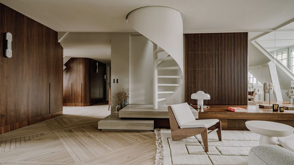
Verocotrel’s Stairway to Heaven design was inspired by American mid-century modernism (Photography: Amaury Laparra)
The quiet luxury trend can also be seen as a reaction against the overblown, visual cacophony of maximalism. While flamboyant interiors can be thrillingly theatrical, their appeal arguably palls fast – fun to dip into temporarily in a hotel, say, but not to be embraced permanently. In the light of pressing environmentalist concerns, a layered, more-is-more philosophy seems wasteful, self-indulgent and likely to date quickly.
“There’s been a noticeable reaction against ostentatious interiors,” says Margit Argus, founder of architects practice Studio Argus, based in Tallinn, Estonia. “A desire for simplicity and a thoughtful choice of materials signifies a collective yearning for authenticity. This movement is a response to our fast-paced world, with individuals seeking solace in calm spaces.”
Influenced by new circumstances and contemporary concerns, the style is becoming increasingly popular. “The trend aligns with a growing emphasis on wellness and mindfulness,” says Pauwels. “It’s also propelled by a desire for serenity amid turbulent times.”
Some believe a commitment among designers and their clients for sustainability is increasingly stoking a demand for more enduring materials and a comparatively timeless aesthetic. “The adoption of a quiet colour palette is intricately intertwined with concerns for the environment,” says Argus. “The neutral tones of quiet luxury frequently originate from a growing use of eco-friendly materials.”
Some established interior designers have always favoured a pared-back look, in the belief that our homes are a haven that cocoon us from the frenetic pace of public life, and don’t see it as a passing trend. “This has never been a trend for us but something I’ve always gravitated towards,” says Nicole Hollis, a San Francisco-based interior designer who has undertaken residential projects in the US and Europe. Her interiors are uncluttered and feature striking sculptural furniture and neutral colours, such as charcoal grey and ivory.
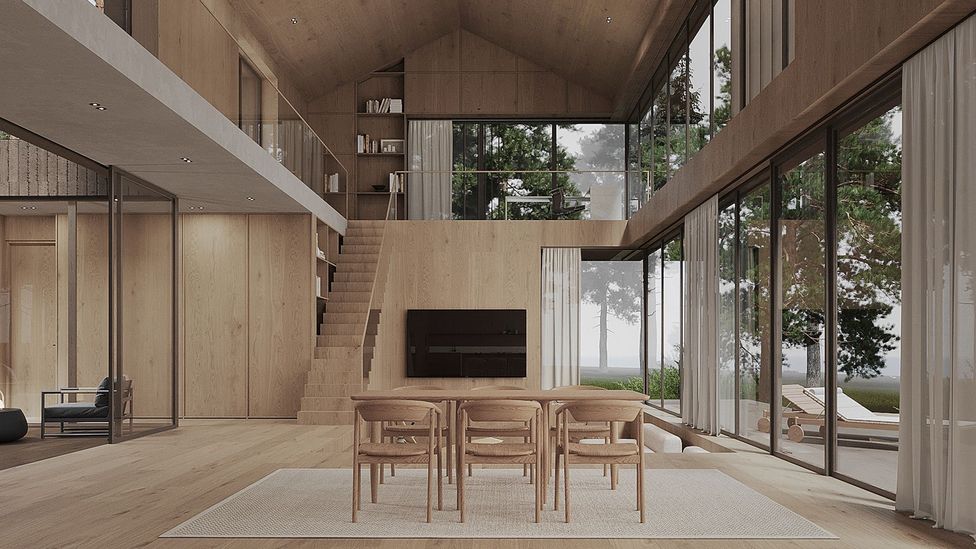
Estonian design firm Studio Argus adopts a neutral palette and uses eco-friendly materials (Credit: Studio Argus)
She believes the pandemic made people more aware of the serenity home life provides. “A key question for us now is ‘How does this space make me feel?’ Quiet, refined, calm spaces with considered elements and open spaces are what ultimately feel soothing. Key ingredients of the style are symmetry, an avoidance of diagonal lines, natural materials and a muted palette, which quiet our senses and allow us to recharge. I’m attracted to art that can overwhelm the senses but I wouldn’t want to live in a space that feels like this.”
Consistent use of materials is important, she says. “We carve elements from the same block of stone or marble to give continuity to a space,” she says. “For example, we’ve worked on homes in the US where we’ve gone to Italy to source marble, and selected a block that is laser-cut for all slabs, counters, sinks and doors. The veining matches throughout and shows a consideration for fine detail.”
Historical precedents for the style, she adds, include architect Piero Portaluppi’s Villa Necchi in Milan – a mansion that was pioneering for melding Italian rationalism, Art Deco and state-of-the-art creature comforts, such as central heating, electric blinds and a dumb waiter.
Identifying a house’s key qualities and bringing them out via carefully considered design details is another characteristic of the look, says Richard Parr: “In my projects, I draw the design out of the place itself. I use locally sourced materials that don’t jar with a house’s environment – and in inventive ways. Our interiors are very architectural – we keep to the fabric of the building, only adding a simple layer. For a house in Suffolk, we are installing glazed ceramic tiles inspired by amazing colours I saw on a local river shore.”
What tips can designers give to achieve the style in an accessible way? “Make sustainable choices when selecting furniture, and mix old and new pieces,” counsels Clémence Pirajean, co-founder of London-based interior and product design studio Pirajean Lees. “Avoid trends. Instead create a look that’s personal and tailored to your lifestyle. Incorporate objects you’ve collected on your travels abroad. Accumulating items over time will help establish your home so it doesn’t look brand new but feels timeless and lived-in.”
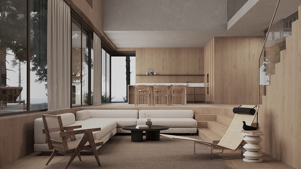
Quietly luxurious interiors have a timeless, pared-back sensibility (Credit: Studio Argus)
Rasmus Graversen, a scion of the Graversen family that established Danish furniture brand Fredericia in 1911, suggests allowing furniture to age naturally. “With furniture and other homeware it’s about showing you dare to let them acquire patina. For example, instead of putting lacquer on brass to stop it rusting, let it age naturally.”
The quiet luxury aesthetic might seem beyond the reach of most of us, but it also springs from a mindset that believes less can be more, says Jo Littlefair of London-based interior design practice Goddard Littlefair. “An accessible entry into this aesthetic is a more mindful approach,” she advises. “Decluttering is paramount. A few standout pieces can transform a room. It’s a style embodied by thoughtful curation.”