





A Decade-Old Script Gets Its Moment
Europe’s Copernicus Browser quietly updated on August 4 with something fire researchers, journalists, emergency managers, and curious civilians have needed for a long time: a dedicated wildfire visualization layer built directly into the interface, requiring no coding knowledge, no subscription, and no specialized software to use. The layer draws on imagery from the European Space Agency’s Sentinel-2 satellites and color-codes what it finds – active fires appear white or yellow, burning vegetation turns red, and land already consumed shows up in dark brown or black.
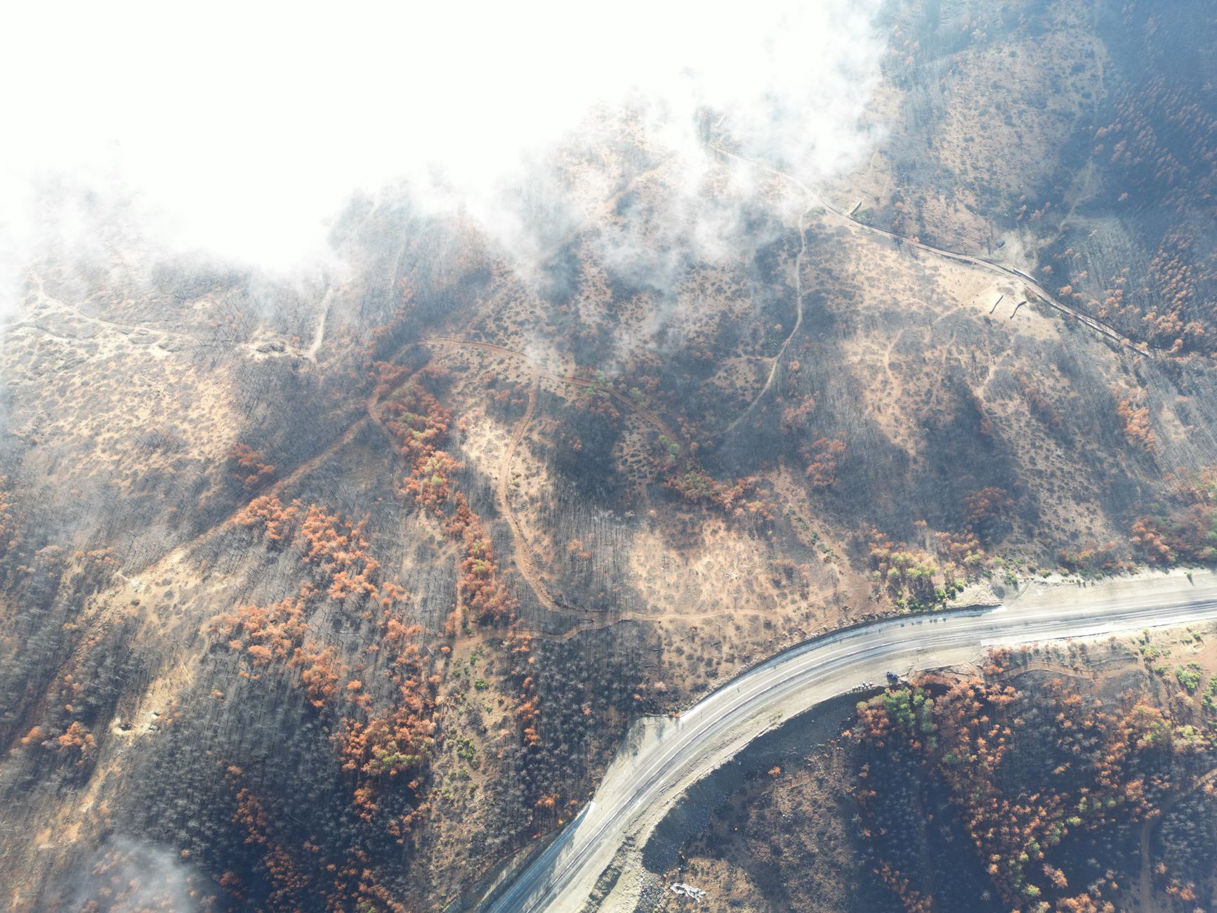
What makes this worth paying attention to isn’t just the feature itself but how long the underlying logic has existed. The wildfire visualization script that now powers this layer originated nearly a decade ago. It was already out there, already functional, already capable of pulling meaningful fire data from multi-spectral satellite bands – it just wasn’t surfaced as a default option inside the browser. Until now, Copernicus Browser offered 10 preset visualization layers using various combinations of spectral data. Wildfire wasn’t one of them. That gap has quietly closed.
The Copernicus program is the European Union’s Earth observation initiative, and its satellite arm does the heavy lifting.
What the Sentinel-2 Satellites Actually Capture
The Sentinel-2 mission consists of three satellites that have earned a reputation for wildfire monitoring specifically because of how they see the world. Their multi-spectral imaging covers both visible light and near-infrared bands, and the resolution gets as granular as 10 meters – fine enough to distinguish between a fire front advancing through scrubland and smoke drifting over already-burned terrain. That level of detail matters when the difference between those two readings can determine whether an evacuation order holds or lifts.
Near-infrared imaging is where fire detection really earns its keep. Fires that look like smoke columns in standard visible-light photography become clearly defined heat signatures in infrared bands, and the new wildfire layer in Copernicus Browser is built to display exactly that distinction without requiring the user to manually configure band combinations. Previously, getting that kind of layered view meant knowing which spectral bands to stack – short-wave infrared against near-infrared, for instance – and doing it yourself inside the interface. The new layer collapses all of that into a single click.
Access to the Copernicus Browser and its underlying Sentinel-2 imagery is free and open to anyone. The European Space Agency does not charge for this data, which is a meaningful detail when you consider that comparable commercial satellite imagery – the kind used by insurance adjusters and municipal planners – can run to significant per-image licensing costs. The open-access model means a volunteer fire spotter in Portugal and a logistics coordinator in California are working from the same satellite data pool as a government agency. That parity is not accidental; it is structural to how the Copernicus program was designed.
Who This Actually Helps and How
The practical value of simplifying wildfire visualization inside a publicly accessible tool is easy to underestimate. Wildfires have forced evacuations of critical infrastructure – including NASA’s Deep Space Network complex in Spain – and the gap between when a fire starts moving and when ground-level reporting catches up can stretch for hours. Satellite imagery that anyone can pull up and interpret without training compresses that gap. It doesn’t replace professional fire behavior analysis, but it puts a functional first read in more hands faster.
Emergency responders and local governments in fire-prone regions have used Sentinel-2 imagery for years, but the workflow required a working familiarity with the browser’s band-combination system. That friction kept it a tool for people who had already taken the time to learn it. A named, color-coded wildfire layer removes that friction entirely. Someone who has never opened the Copernicus Browser before can navigate to a fire location, click the wildfire layer, and immediately read what the satellite is showing them – active burn areas, char boundaries, and the transition zones in between.
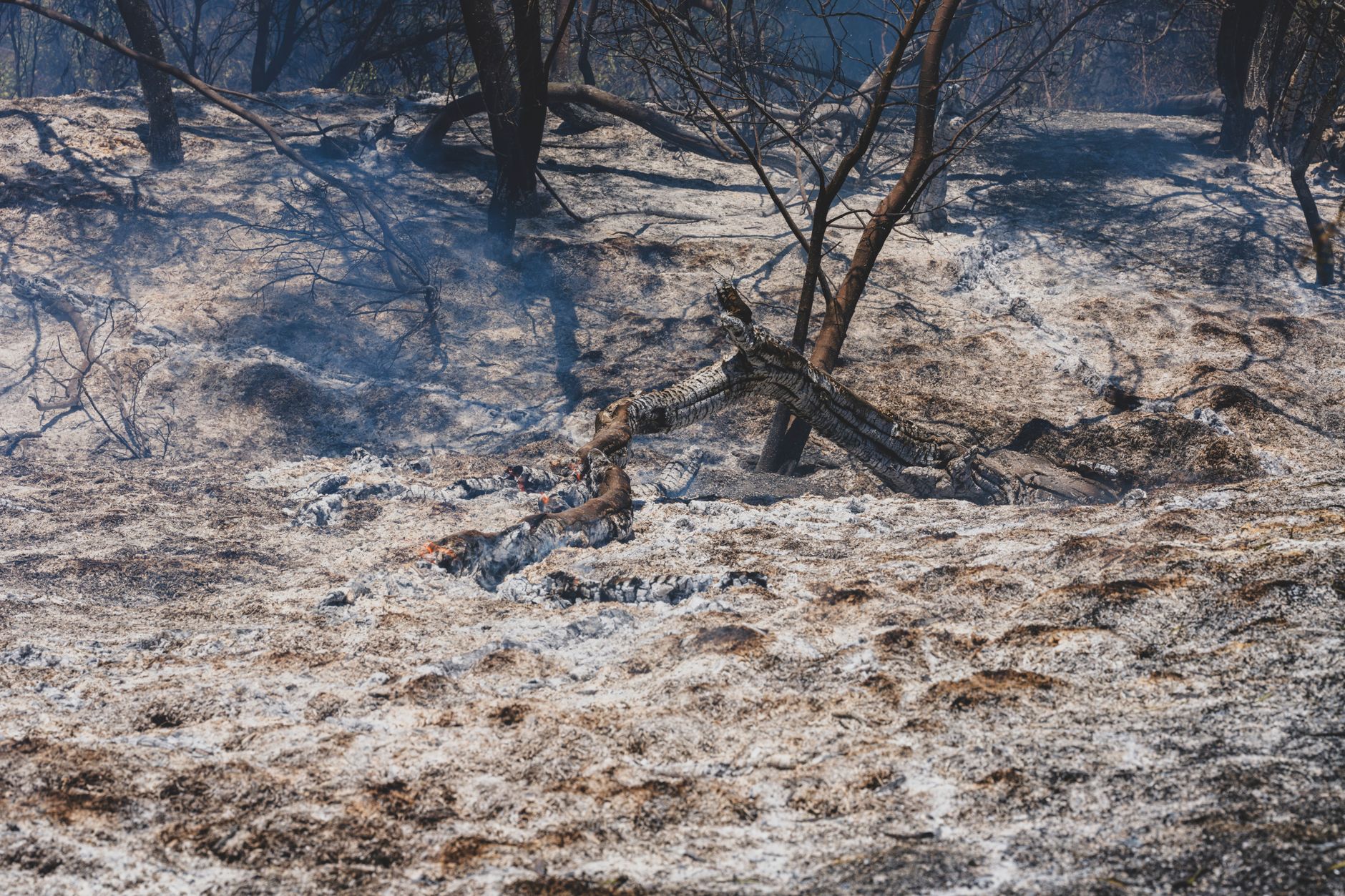
The color scheme the layer uses is worth understanding once before relying on it. White or yellow indicates active fire. Red marks vegetation that is burning or recently burning. Dark brown and black represent land that has already been consumed. These aren’t arbitrary aesthetic choices – they map directly to the spectral signatures the satellites detect, with each color anchored to specific reflectance values in the near-infrared and short-wave infrared ranges. Reading the layer correctly means understanding that red is not safe ground; it is the active margin.
Free Data, Real Stakes
There is a version of this story where a decade-old visualization script getting promoted to a default browser layer sounds like minor housekeeping. The August 4 rollout did not come with a press conference or a product launch – it was an update to a browser interface that most people outside of satellite remote sensing have never opened. But the context around it is not minor. Wildfire seasons are longer, the fires themselves are burning hotter and faster in more places, and the window for useful situational awareness keeps shrinking. A tool that was already accurate, already free, and already built on one of the most capable Earth observation satellite constellations in orbit just became meaningfully easier to use – and the question now is whether the people who most need it know it exists.